I almost don’t know how to compose an entry that doesn’t have anything to do with art I’ve made, my tattoo progress, or a concert I’ve just been to. D: This needs to change, and it will, starting now.
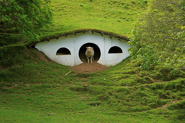
So, this has been popping up on various LOTR-related sites over the past week and is just too cute not to share.

There are sheep living in abandoned hobbit holes! Well, probably not right now as the set is under construction, but come on, how adorable is that!?
It’s a good thing I didn’t sign up for any yoga classes because I’ve been so busy working on Dybbuk’s MySpace layout that I really wouldn’t have had time for them. Their first show is already this Friday at Vnuk’s Lounge, so I’ve been hurrying to make sure it will be ready before then. MySpace’s coding is incredibly frustrating to work with, and I recently learned that the layout I designed will be obsolete in the near (or hopefully not so near) future. Most band profiles use the Version 1 layout, and I’ve read that it’s just a matter of time before MySpace forces everyone to switch over to Version 2, where nothing is aligned or centered in a way that makes sense or is visually appealing for the artist pages. Just look at Amon Amarth’s new layout on Version 2. What an ugly mess! The main problem now is that there are very little HTML or CSS resources out now for this version, but I’m hoping once it does switch over, tutorials for the coding will follow shortly after or else there’s going to be some really messed-up looking band layouts for a while. Unfortunately, with MySpace you can’t just use a nice, organized CSS stylesheet like you can with LiveJournal customizations. I’ve just got it all sorted out so that it works in Safari and Firefox, but I still need to check it using Internet Explorer, Chrome, and Opera. It looks great on my MacBook Pro and my sister’s Asus laptop, but I’m also going to check it on the ancient PC my parents use just to make sure. I also have to finish the illustration for the header image today, and then it’ll be finished.
I just want Dybbuk to have the layout before the show in case they want me to make any changes. I think their MySpace page will get a spike in visitors after they see them perform live and hopefully want to know more about the band. Here’s the link to their MySpace if you want to check out a couple samples of their music. (I’ll also repost a link once they have the new layout up so you guys can check that out as well if you’re interested.) They’ve been in the studio recording their first EP this summer, which will be out in fall. I know it’s my friends’ band and all, but there aren’t many good bands from Milwaukee, so I have a lot of faith in them to improve the scene. Dybbuk started out playing progressive technical death metal, but found this power metal singer from up north, which I think makes for an interesting combination. Since I’m taking photos for the band at the show, I get to be let in as part of the band and get free drinks all night! It should definitely be a good time, even if all the other bands sound like a bunch of chaotic death metal noise. I’m a little disappointed I’ll be missing the Young Dubliners at Irish Fest that night, since I’ll have to go tomorrow instead and they’re not playing then. The Red Hot Chilli Pipers will be there, though, so I’m sure it will still be fun. I’m also finally old enough to try some of their mead, so I’m crossing my fingers they still have it there! ;) I refuse to go over the weekend because $15 for a ticket and another $15 for parking is ridiculous. At least admission is free on Thursday with a donation of school supplies!
While I’m on the topic of metal, you’ve got to check out this animated video for Ensiferum’s "One More Magic Potion" if you haven’t seen it already. This is one of my favorite songs of all time, and I just love all the imagery from the Norse myths and the Kalevala.
So, this has been popping up on various LOTR-related sites over the past week and is just too cute not to share.

There are sheep living in abandoned hobbit holes! Well, probably not right now as the set is under construction, but come on, how adorable is that!?
It’s a good thing I didn’t sign up for any yoga classes because I’ve been so busy working on Dybbuk’s MySpace layout that I really wouldn’t have had time for them. Their first show is already this Friday at Vnuk’s Lounge, so I’ve been hurrying to make sure it will be ready before then. MySpace’s coding is incredibly frustrating to work with, and I recently learned that the layout I designed will be obsolete in the near (or hopefully not so near) future. Most band profiles use the Version 1 layout, and I’ve read that it’s just a matter of time before MySpace forces everyone to switch over to Version 2, where nothing is aligned or centered in a way that makes sense or is visually appealing for the artist pages. Just look at Amon Amarth’s new layout on Version 2. What an ugly mess! The main problem now is that there are very little HTML or CSS resources out now for this version, but I’m hoping once it does switch over, tutorials for the coding will follow shortly after or else there’s going to be some really messed-up looking band layouts for a while. Unfortunately, with MySpace you can’t just use a nice, organized CSS stylesheet like you can with LiveJournal customizations. I’ve just got it all sorted out so that it works in Safari and Firefox, but I still need to check it using Internet Explorer, Chrome, and Opera. It looks great on my MacBook Pro and my sister’s Asus laptop, but I’m also going to check it on the ancient PC my parents use just to make sure. I also have to finish the illustration for the header image today, and then it’ll be finished.
I just want Dybbuk to have the layout before the show in case they want me to make any changes. I think their MySpace page will get a spike in visitors after they see them perform live and hopefully want to know more about the band. Here’s the link to their MySpace if you want to check out a couple samples of their music. (I’ll also repost a link once they have the new layout up so you guys can check that out as well if you’re interested.) They’ve been in the studio recording their first EP this summer, which will be out in fall. I know it’s my friends’ band and all, but there aren’t many good bands from Milwaukee, so I have a lot of faith in them to improve the scene. Dybbuk started out playing progressive technical death metal, but found this power metal singer from up north, which I think makes for an interesting combination. Since I’m taking photos for the band at the show, I get to be let in as part of the band and get free drinks all night! It should definitely be a good time, even if all the other bands sound like a bunch of chaotic death metal noise. I’m a little disappointed I’ll be missing the Young Dubliners at Irish Fest that night, since I’ll have to go tomorrow instead and they’re not playing then. The Red Hot Chilli Pipers will be there, though, so I’m sure it will still be fun. I’m also finally old enough to try some of their mead, so I’m crossing my fingers they still have it there! ;) I refuse to go over the weekend because $15 for a ticket and another $15 for parking is ridiculous. At least admission is free on Thursday with a donation of school supplies!
While I’m on the topic of metal, you’ve got to check out this animated video for Ensiferum’s "One More Magic Potion" if you haven’t seen it already. This is one of my favorite songs of all time, and I just love all the imagery from the Norse myths and the Kalevala.
'One More Magic Potion' Animated Tribute from Celine Lester on Vimeo.

